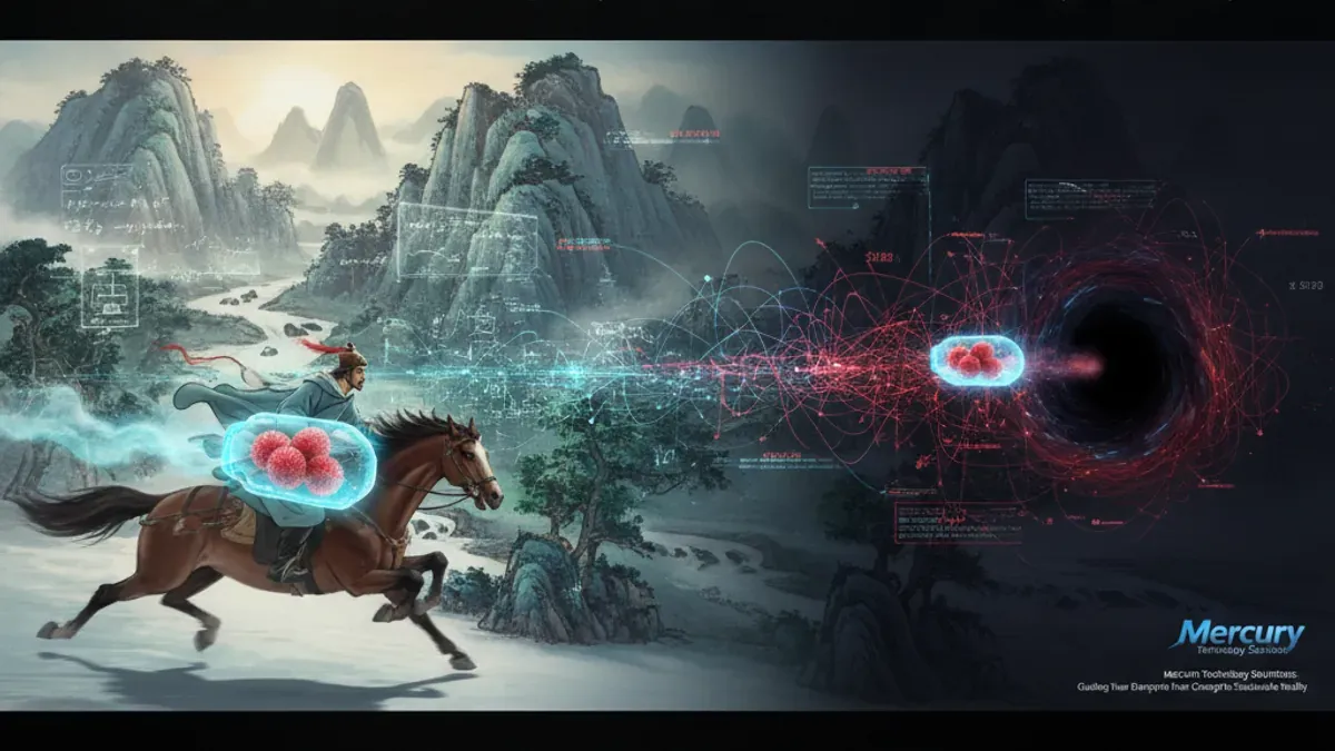
3 min remaining
0%
品牌識別與演變

水星的新標誌(2021)— 一個有解的拼圖標誌

水星科技解決方案在2021年推出了全新的品牌形象,象徵著他們向利基市場解決方案的轉型,並以動態的拼圖靈感標誌為特色。

3 min read
Progress tracked
3 分鐘閱讀

水星科技解決方案揭示全新的品牌形象

簡而言之:水星科技解決方案推出了全新的品牌形象,將標誌性的方形「M」替換為以拼圖為靈感的解決方案圖標。這一變化反映了我們向提供「利基」垂直市場解決方案的轉型,並展示了我們隨著客戶需求不斷演變的承諾。

擁抱變革:一個新時代的新標誌

在水星科技解決方案,我們很高興地揭示我們更新的品牌形象,這是我們演變和承諾為多元產業提供量身定制解決方案的見證。隨著我們從「盒子裡的傑克」的方式轉向專注於利基市場解決方案,我們的新標誌象徵著這一轉變,並展現了我們用創意和創新解決複雜挑戰的決心。

水星標誌演變的旅程

2018–2020:無限時代

水星科技解決方案成立於2018年,最初使用無限標誌,象徵著無盡的可能性。這個標誌在我們的早期階段發揮了良好的作用,體現了力量和連續性。然而,隨著公司成長,我們意識到需要一個更靈活和獨特的表現方式。

2020–2021:推出方形的「M」

我們對新視覺形象的探索引領我們走向「M」的幾何詮釋。這第二個標誌版本捕捉了精美製作的盒子的本質,提供了簡單性和趣味性。

2021年及以後:解決方案的拼圖

今天,我們自豪地展示我們的新字標和圖標,這是與領先品牌設計師關志文合作開發的。這一最新設計從古老的水星符號——雙蛇杖中獲得靈感,體現了拼圖的概念——一個動態且令人滿意的解決方案,隨著時間不斷演變。

為什麼選擇拼圖符號?

新推出的符號為我們提供了創意靈活性,並作為我們視覺工具中的強大工具。它反映了我們對科技的看法——不斷演變、持續解決問題,並對未來保持好奇。在水星,總有新的解決方案在地平線上。

我們品牌的使命與未來

自成立以來,水星的使命一直是提供全面的解決方案,賦能全球中小企業。雖然這一使命保持不變,但我們的方式不斷演變,提供更深入和更周到的解決方案,針對特定產業量身定制。我們的新品牌形象反映了我們的身份、過去的歷程以及未來的方向。

隨著我們周圍的世界不斷變化,我們也在變化。我們的旅程是成長、創新和對客戶不變的承諾。通過我們的新品牌形象,我們重申了通過科技構建更佳商業解決方案的決心。

感謝您成為我們旅程的一部分。我們期待著共同創造未來。

Frequently Asked Questions

What does Mercury Technology Solution's new logo represent?

The new logo symbolizes Mercury's shift towards providing niche market solutions. It features a puzzle-inspired logomark that reflects the company's commitment to creativity and innovation in solving complex challenges.

Why did Mercury Technology Solution change its logo from the boxed 'M'?

The change from the boxed 'M' to the new puzzle-inspired logo represents the company's evolution and growing focus on tailored solutions for specific industries. It signifies a departure from a more generic approach to a specialized and dynamic identity.

Who designed the new logo for Mercury Technology Solution?

The new logo was developed in collaboration with leading brand designer Joe Kwan, who helped create a design that captures the essence of Mercury's mission and its commitment to solving industry-specific challenges.

How does the new logo reflect Mercury's brand mission?

The new logo encapsulates Mercury's mission to empower SMEs by embodying flexibility and creativity in its design. It reflects the company's ongoing commitment to evolving its solutions to meet the changing needs of its clients.

What inspired the design of the new logomark?

The design of the new logomark was inspired by the caduceus, the ancient symbol of Mercury, and the concept of a puzzle, representing the dynamic and ever-evolving nature of the solutions Mercury provides to its clients.